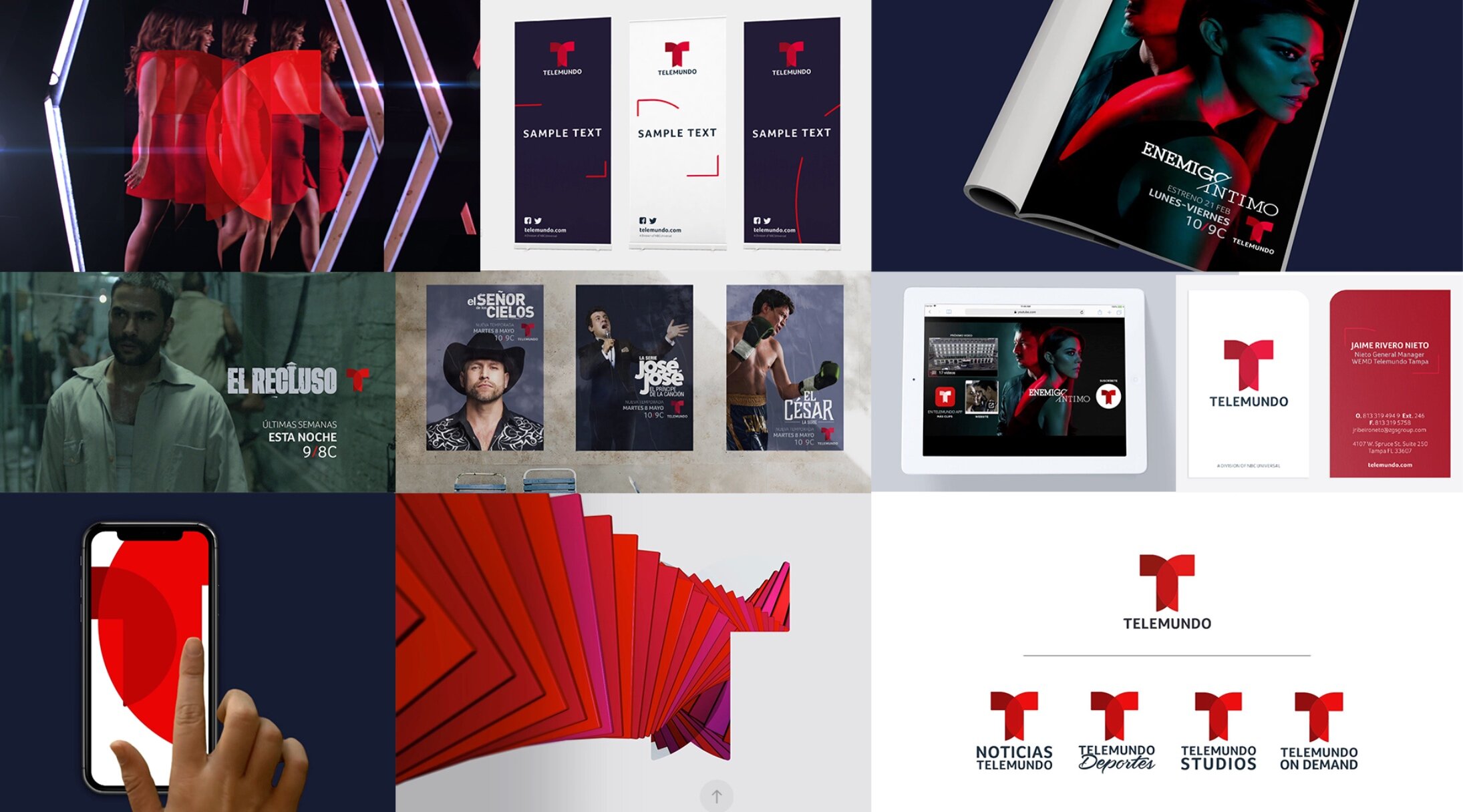
A new brand architecture and design system for the Telemundo network, the leading Spanish-language broadcaster in the United States.
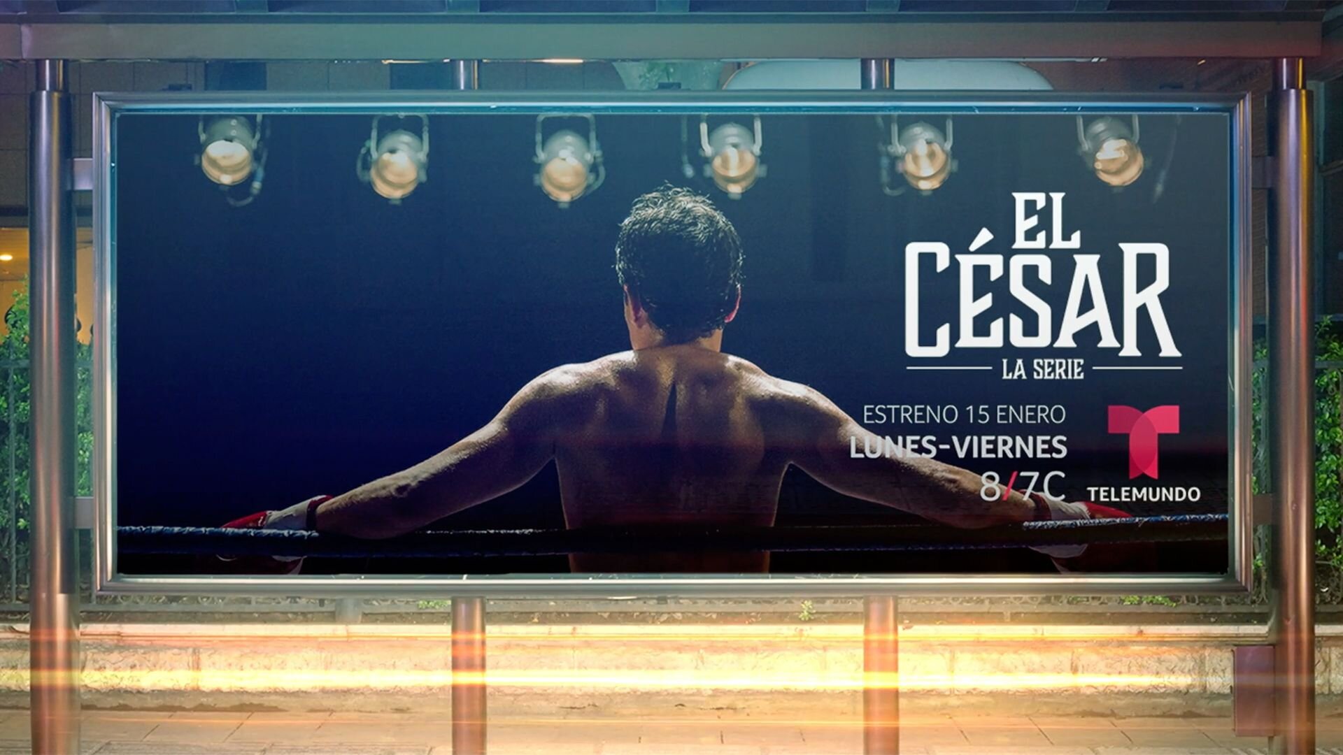
Launching to coincide with their coverage of the World Cup, the rebrand of this Hispanic network included a series of campaign films, realigned logo system, graphic system, brand idents and rules and application examples for out of home and digital applications of the brand including VOD and social.

Realigning the logo system
The first job was to ensure the master brand marque was fit for all applications including small screens. The original concept behind the marque was strong, capturing the two worlds of Hispanic Americans, but the marque and logotype needed to work harder.
A key principle of the brand refresh was to continually drive attribution back to the masterbrand by creating a 'Branded House', realigning all of Telemundo's great content more closely.

The rebrand was rolled out across all marketing and a huge amount of collateral, even including a bicycle!


Creative Director | Amy Johnson Animators | Jun Iwakawa, Richard Sutton Print Designers | Duncan Letcher, Stan Lau Agency | Red Bee Creative
