A new integrated system for Sakshi News India
Ian originally worked on the launch of Sakshi, a channel based in Hyderabad India, in 2009. Following a rebrand in 2014 by a local company, the growth of social media and a lack of discipline in the brand application, Twin-Associates was invited to work with the team in Hyderabad on a relaunch for their 15th anniversary in 2024 to create a distinctive new brand system that for the first time covered all platforms and gave the internal team the tools and guidance they needed.
A world of red
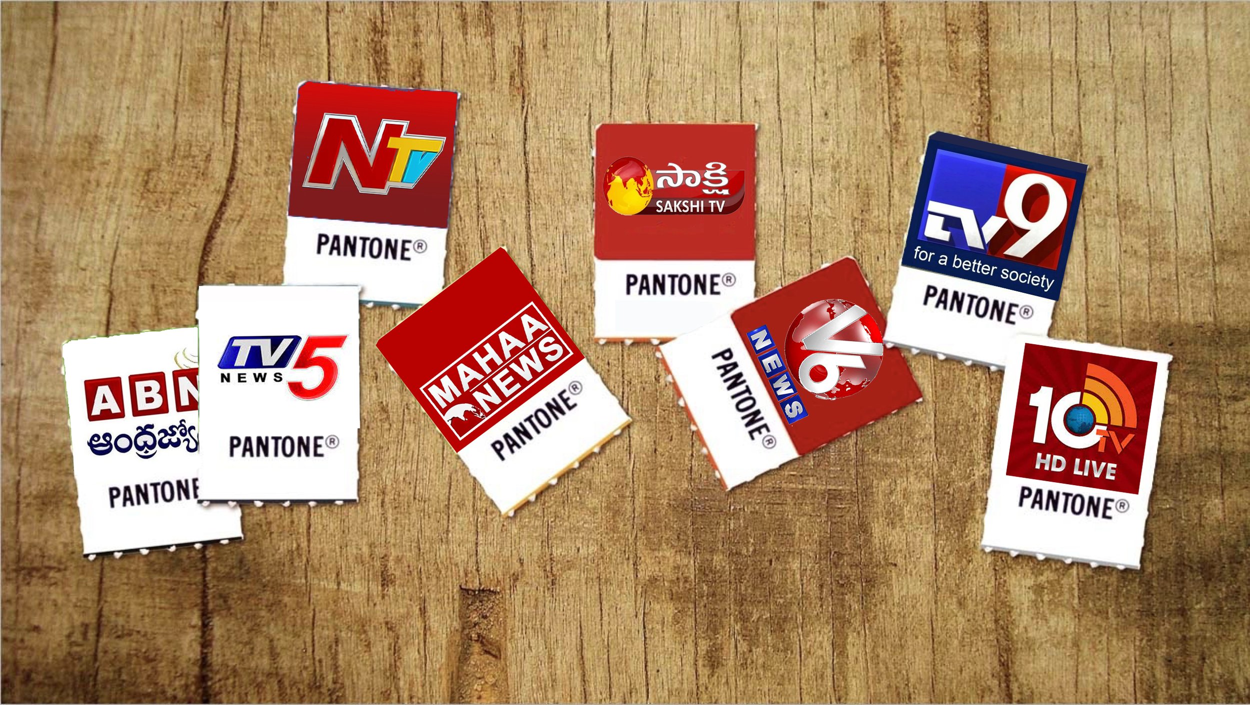
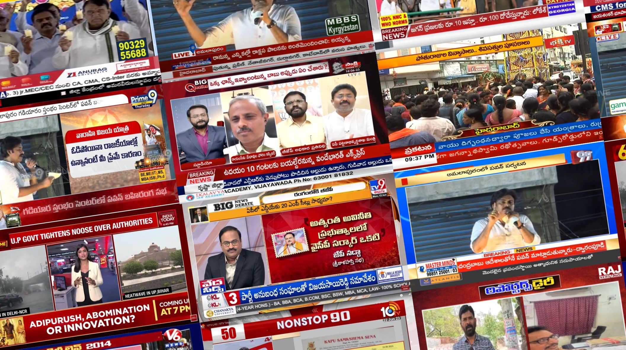
Visually all of the News channels in the region have taken on red as their primary colour removing any possibility of distinction or recognizability through the use of colour.
A new future fit icon
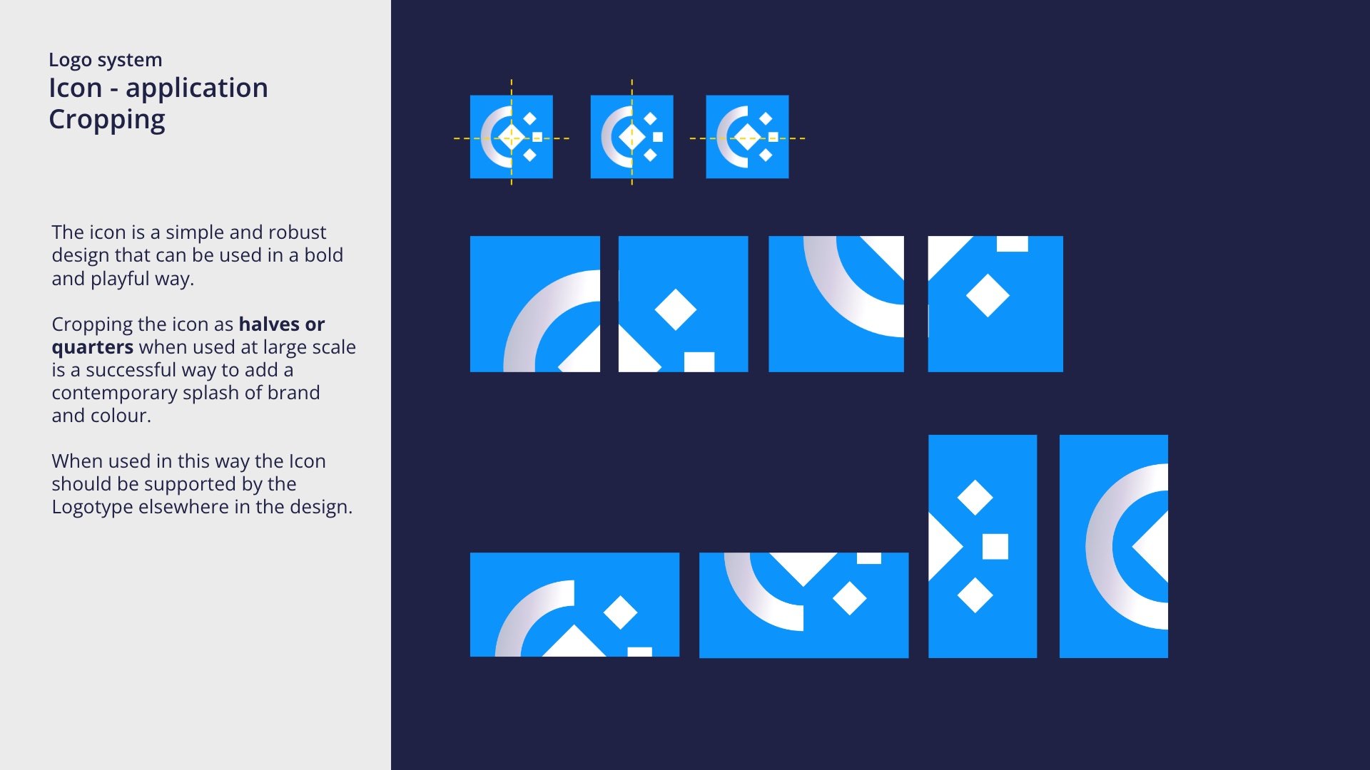
Sakshi lacked any form of unique brand icon that could be successfully used at small scale or work as a shorthand visual mark for the channel. As Sakshi means Witness an icon was developed using the references of the moon, the sun and an eye that showcases Sakshi as the 24/7/365 witness. The icon forms an integral part of the navigation systems to create a seamless flow from titles to headlines and introduces the promo system.


A distinctive fresh approach
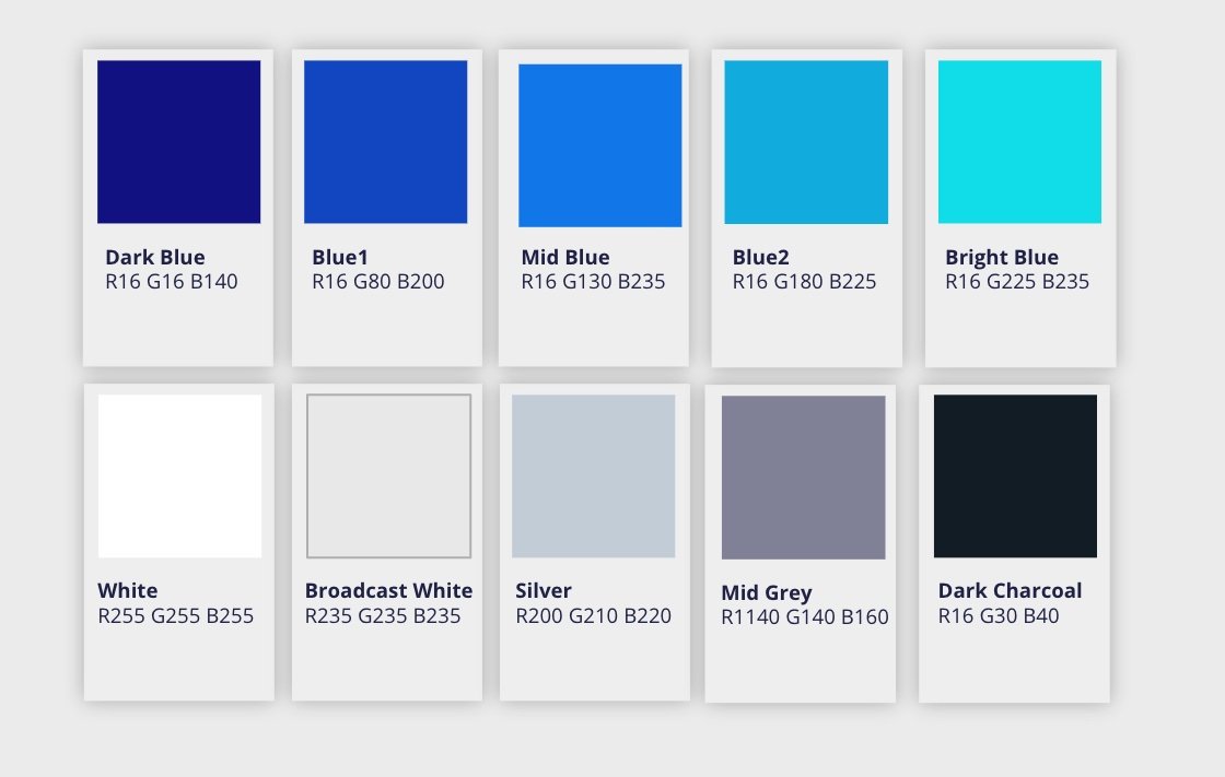
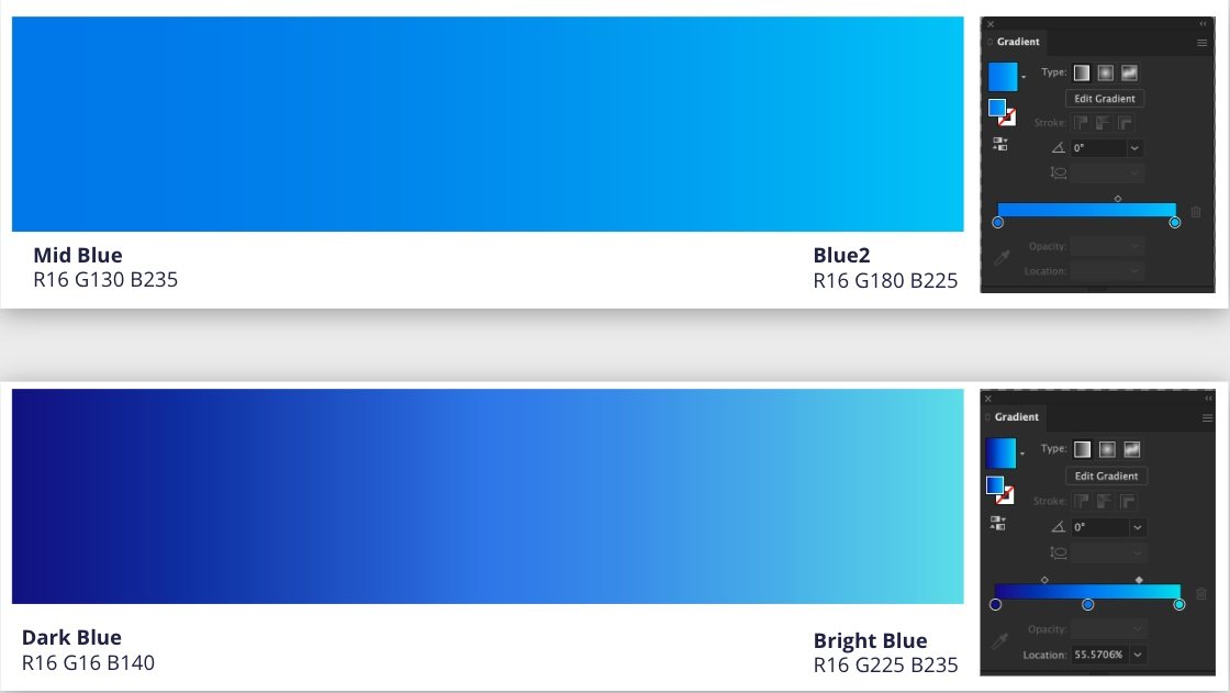
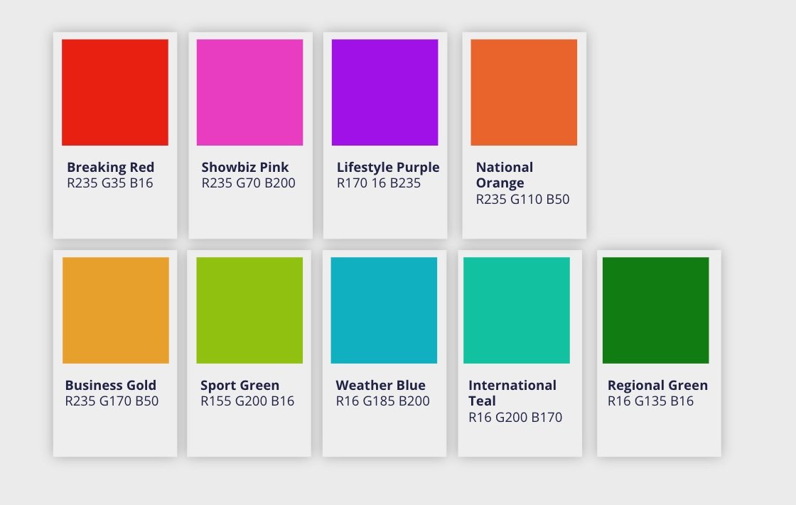
A new colour palette was created to distinguish Sakshi from their competitors and deliver a vibrant set of complimentary colours to be used across their News segments.
Creating a flexible system from physical inspiration
Connecting the workflow of news production with the visual presentation we used the sense of physical filing of stories as an inspiration to create a modern, distinctive, graphical system that could be used, with the new icon, to bring to life the channel brand across its many assets, from the digital to the physical world.




Creating a cohesive brand system that spans all platforms, we’ve ensured that Sakshi has a strong, consistent identity moving forward.
