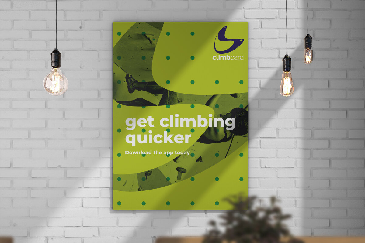
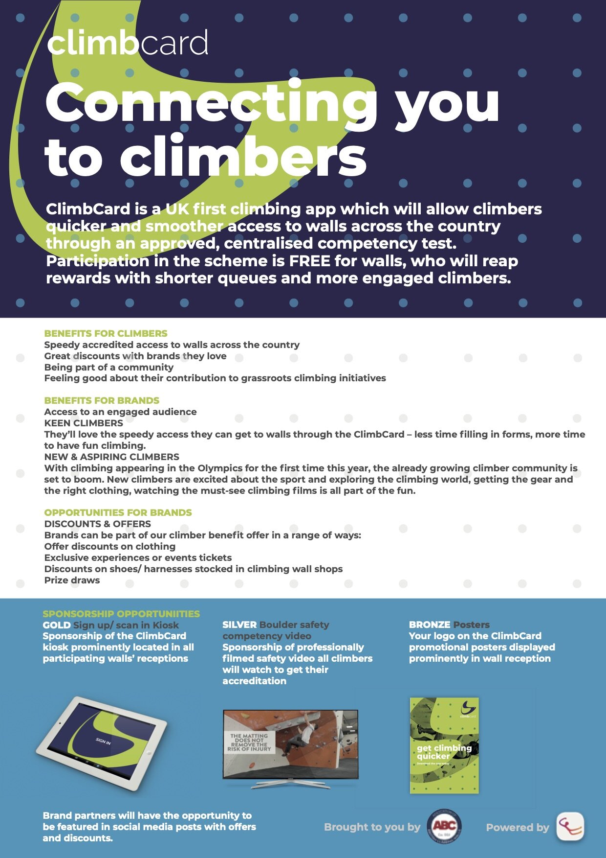
Developing a brand for the first consumer facing product from The Association of British Climbing.
The ABC wanted to help climbers gain faster entry and rewards at walls across the UK and needed a new name and visual brand for the new app that celebrated this fun & colourful sport whilst building out the offer to include discounts with relevant climbing and sports brands and priority access to climbing events.


A new smarter brand to reflect the young discerning climbers.
To reflect this change from being only about quicker access, a higher order name was required. Further the long original name would be illegible when appearing as an app icon - we needed something smarter and snappier.
The original logo borrowed from the highly traditional, unexciting colour palette of the ABC corporate logo which our new audience of young discerning climbers would have no relationship with.
Visually the original logo bears no reference to climbing which is such a cool and exciting sport with exciting iconography. We wanted to celebrate this fun & colourful sport and use its iconography in an own able way.
The new marque uses modern climbing holds as inspiration, creating a double ‘c’ motif in bold vibrant colour ways.


Strategy | Campfire Collective
