Refining BBC's youngest service brand identity.
BBC Sounds had successfully been launched a little over a year earlier, when Amy was asked to help refine its visual identity to ensure it was fit for its future.
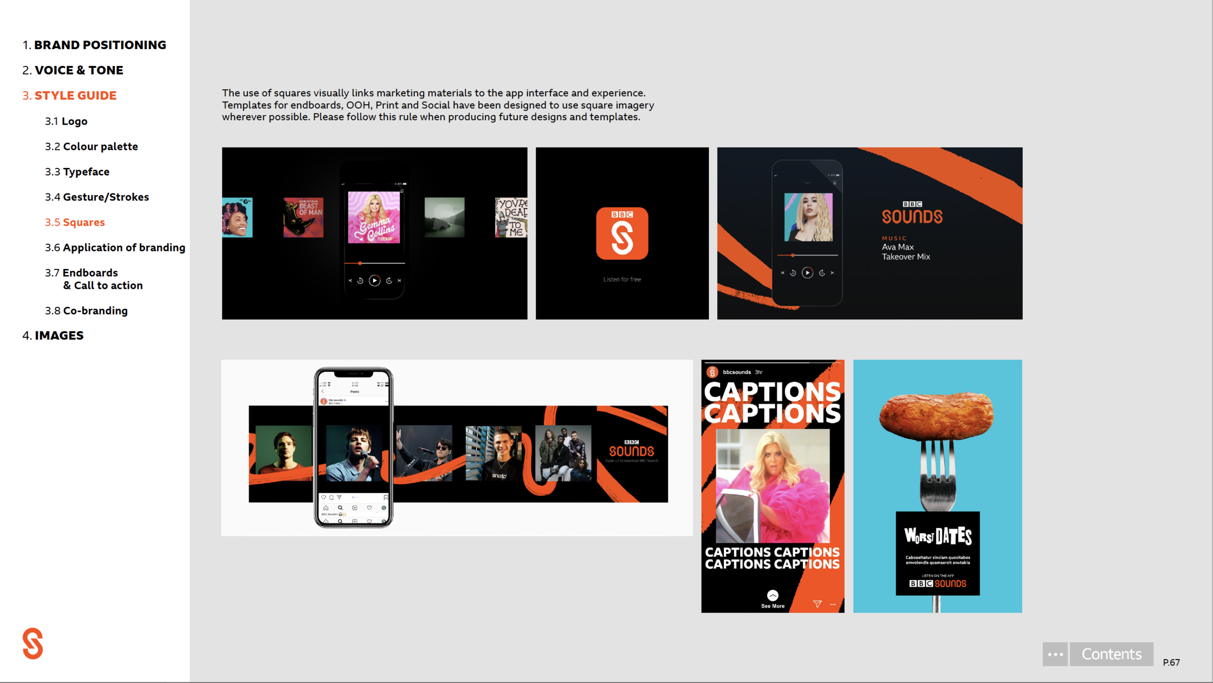
In order to make sure it had stand out amongst the other brands, both in the BBC portfolio and competitive set, one of the first decisions taken was to lean more heavily into the use of the brand colour orange.

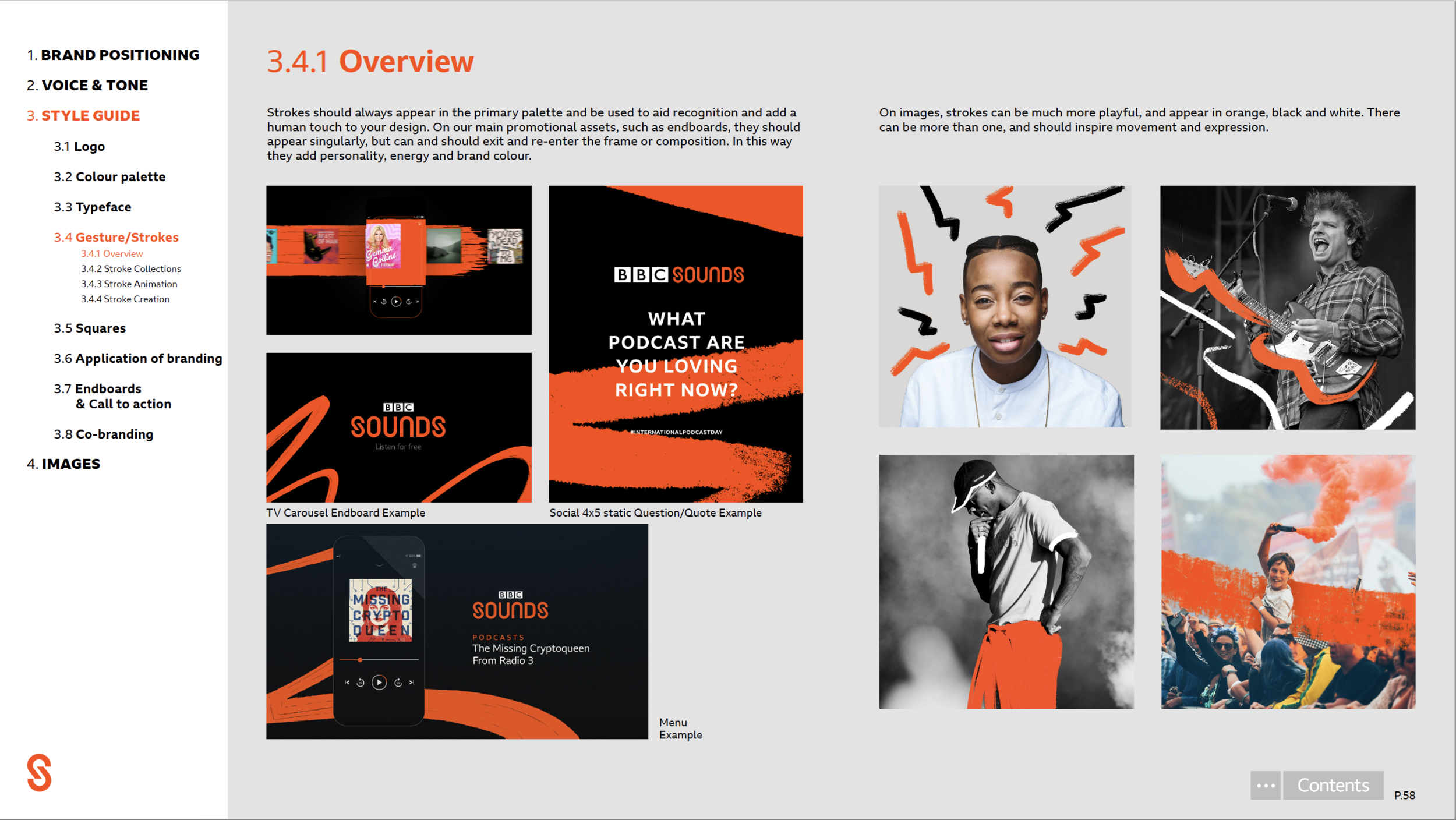
The brand, conceived by Mother, playfully used ‘gestures’ or brush strokes to add personality and energy to the brand, but it was the development of this to use each stroke purposefully in the brand colour to deliver information, rather than for purely aesthetic reasons, that moved the brand on.

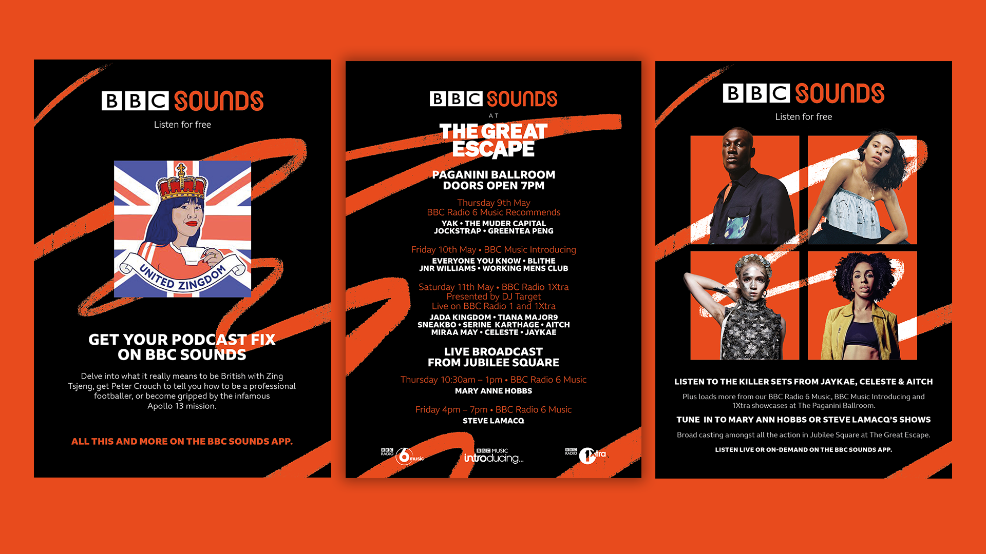

In OOH we added squares to the visual language, as these felt relevant to signify this was an audio offering from vinyl sleeves through CD cases to podcast imagery, and allowed the content creative space to shine.





Design Direction | Amy Johnson Production | Louise Braham Design | Richard Sutton, Ella Harrington Animation | Matt Henry Agency | BBC Creative
