A refresh of the iPlayer brand across its promotions.
BBC iPlayer Marketing were keen to refresh and simplify the brand to give it a more modern expression. The purple gradient and ‘facets’ look of the past felt dated and at odds with the offering.
Amy worked with BBC Creative, the BBC’s in house design team, to review the current assets and build a new set that felt bold and fresh.


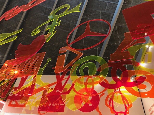
The teams inspiration trip to the Design Museum, where they found the iPlay hanging amongst design classics such as LV, IBM, the Twitter bird and Air Jordan icons, helped to sell in the iconic status of the symbol to the management team and solidify the right to use it away from the logotype.
